MINNEAPOLIS INSTITUTE OF ART | REBRAND
The Minneapolis Institute of Arts was celebrating its 100th anniversary and looking for an identity refresh. As Head of Design & Editorial, I managed and led the entire process, which included issuing an RFP, interviewing and vetting agencies, and working with the Board of Trustees to select the finalist, Pentagram, of New York.
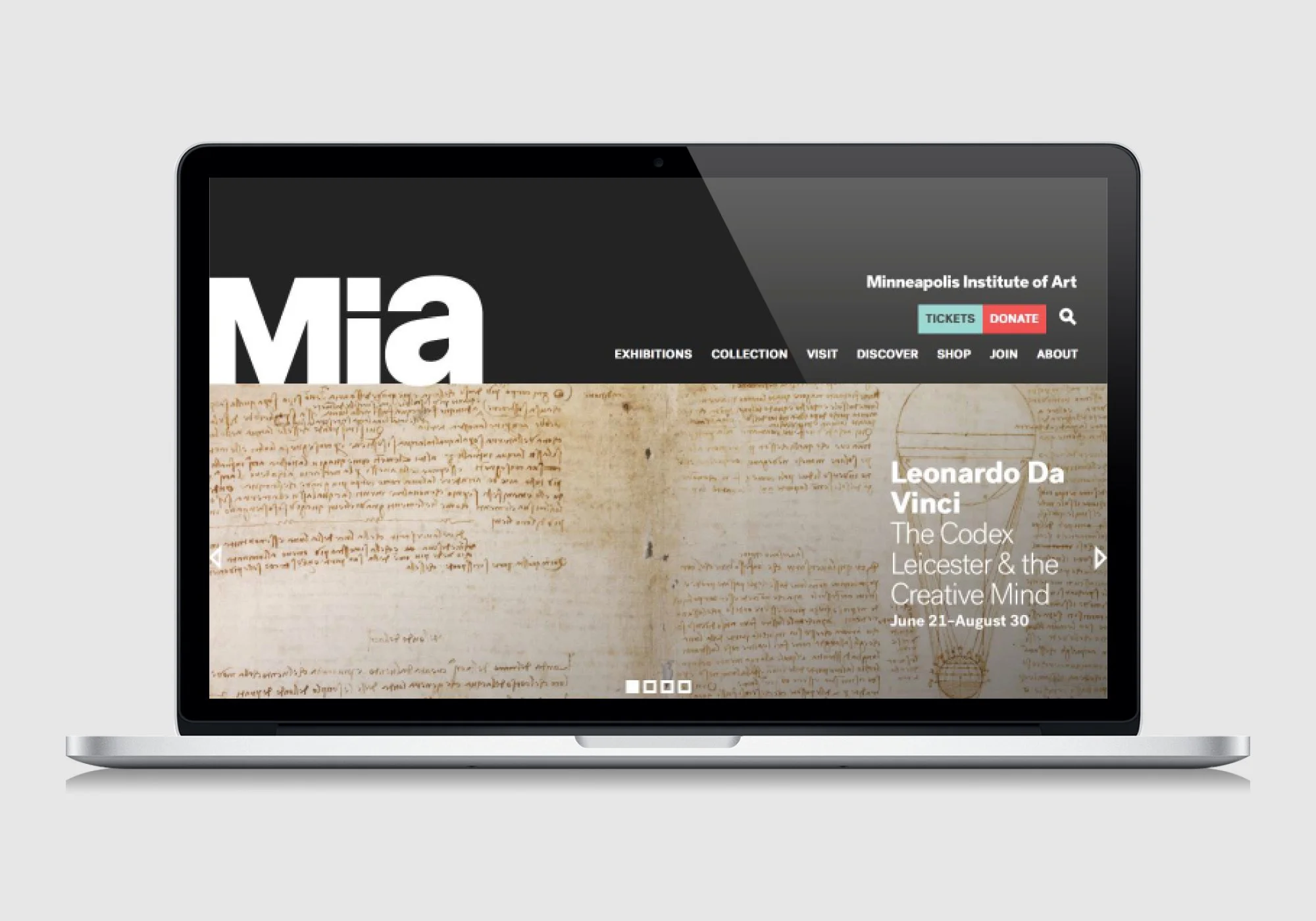
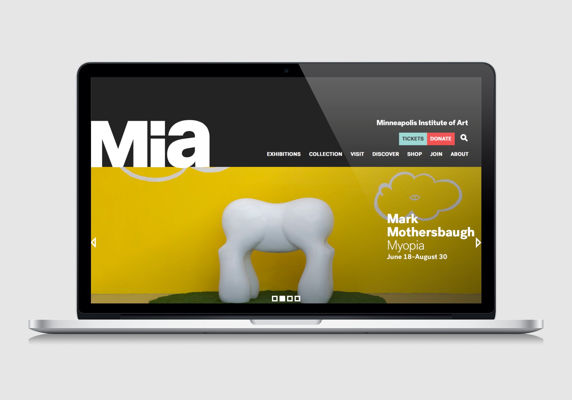
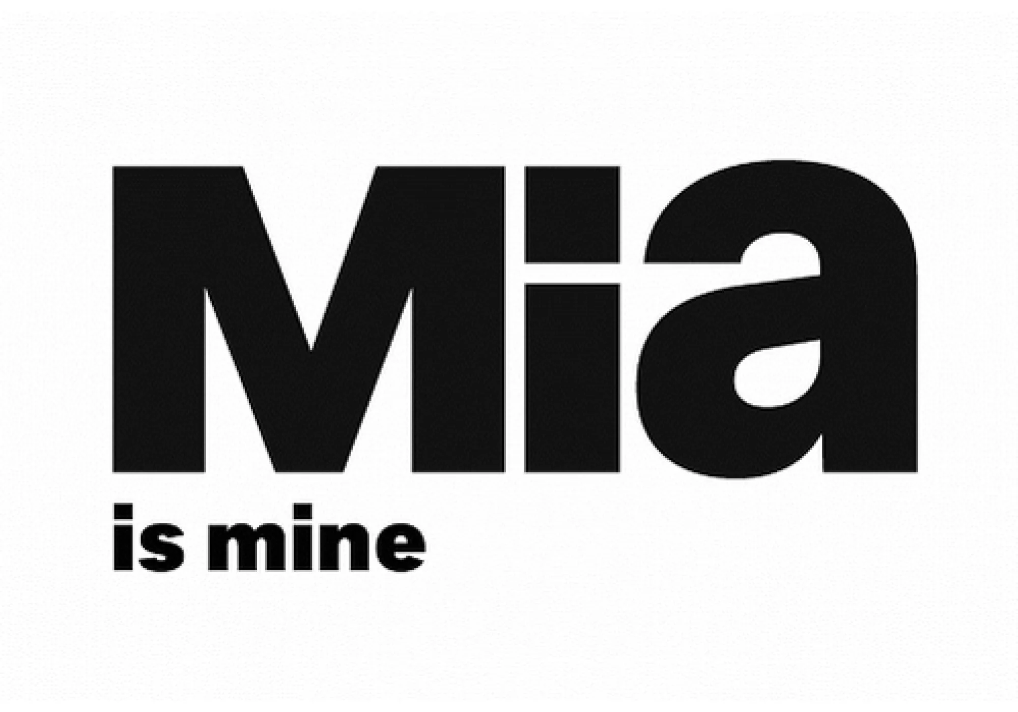
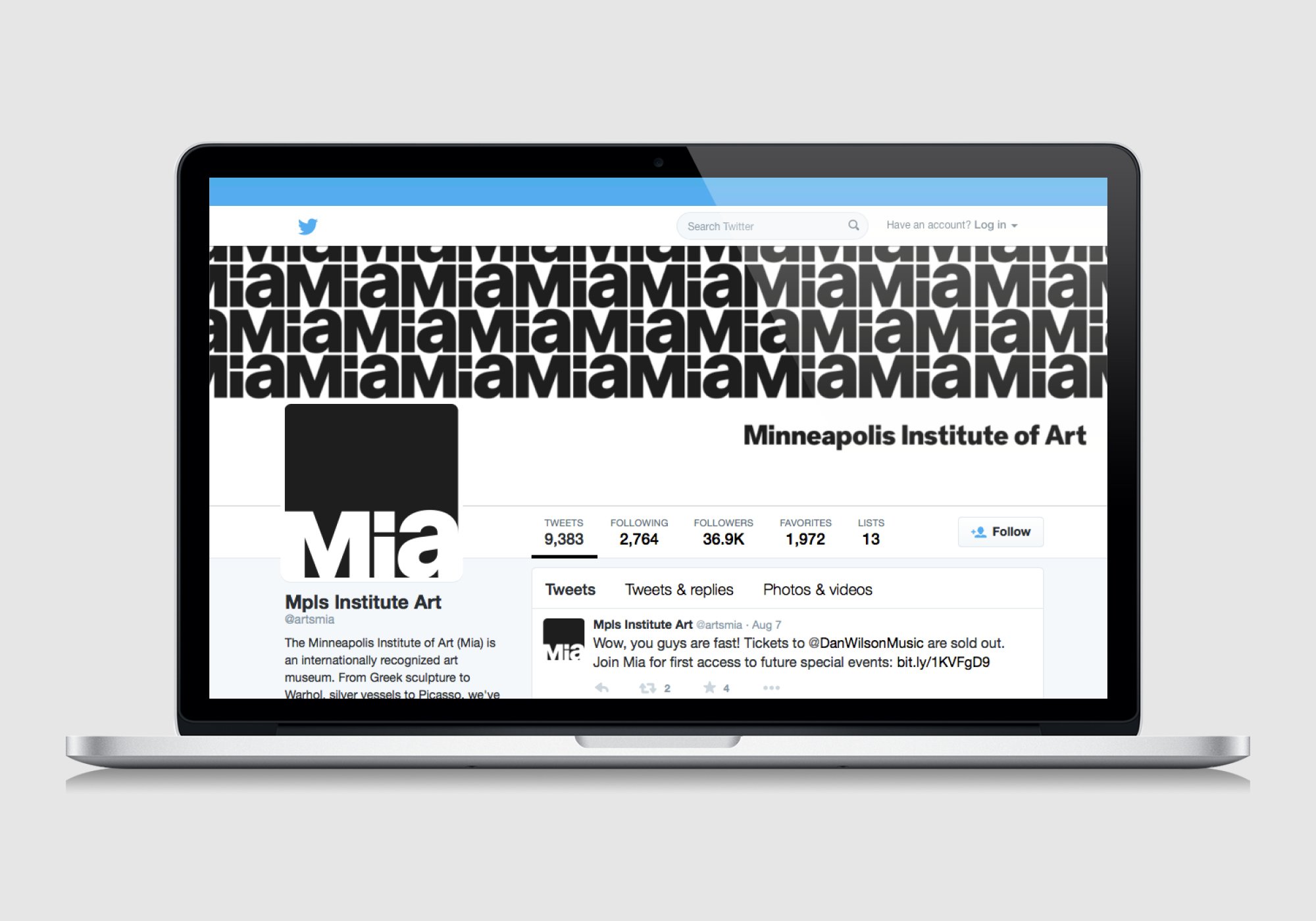
With the rebrand, we created a crisp new typeface, dropped the s in Arts, and changed the acronym MIA to a more personal Mia—meaning “my own” in Italian, “dear” in Slavic languages, and a name used in cultures all over the globe. It couldn’t be more perfect. It's compelling, intimate, modern, and yet true to the museum’s original mission: to make inspiring works of art accessible to all.


Creative Team
Head of Design & Editorial, Mia: Liana Raudys
Agency: Pentagram
MPR News: “Minneapolis Institute of Arts wants you to call it 'Mia'”